Twitter Weather Radar – Test Data for Language Analytics

3 min read
Today we’d like to share with you some fun charts that have come out of our internal linguistics research efforts. Specifically, studying weather events by analyzing social media traffic from Twitter.
We do not specialize in social media and most of our data analytics work focuses on the internal operations of leading organizations. Why then would we bother playing around with Twitter data? In short, because it’s good practice. Twitter data mimics a lot of the challenges we face when analyzing the free text streams generated by complex processes. Specifically:
- High Volume: The analysis represented here is looking at around 1 million tweets a day. In the grand scheme of things, that’s not a lot but we’re intentionally running the analysis on a small server. That forces us to write code that rapidly assess what’s relevant to the question we’re trying to answer and what’s not. In this case the raw tweets were quickly tested live on receipt with about 90% of them discarded. The remaining 10% were passed onto the analytics code.
- Messy Language: A lot of text analytics exercises I’ve seen published use books and news articles as their testing ground. That’s fine if you’re trying to write code to analyze books or news articles, but most of the world’s text is not written with such clean and polished prose. The types of text we encounter (e.g., worklogs from an IT incident management system) are full of slang, incomplete sentences and typos. Our language code needs to be good and determining the messages contained within this messy text.
- Varying Signal to Noise: The incoming stream of tweets will always contain a certain percentage of data that isn’t relevant to the item we’re studying. For example, if a band member from One Direction tweets something even tangentially related to what some code is scanning for the dataset can be suddenly overwhelmed with a lot of off-topic tweets. Real world data is similarly has a lot of unexpected noise.
In the exercise below, tweets from Twitter’s streaming API JSON stream were scanned in near real-time for their ability to 1) be pinpointed to a specific location and 2) provide potential details on local weather conditions. The vast majority of tweets passing through our code failed to meet both of these conditions. The tweets that remained were analyzed to determine the type of precipitation being discussed.
Figure 1 below shows a summary of the analysis for the afternoon of 14 December 2013. Around this time a major storm system was moving up the eastern seaboard dumping heavy rain and snow along I-95. Twitter commentary indicating locally snowy conditions is displayed in blue, while commentary indicating rainy conditions is displayed in green. The ‘rain/snow’ line that extended from New York City down towards Philadelphia and Washington DC is clearly visible. There are some anomalies (like the blue in southern CA and FL, but the snow noise is small relative to the signal coming out of the northeast).
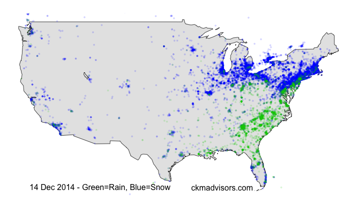
Figure 1: Weather tweets from the afternoon of 14 December 2013, during a major storm along the east coast.
Figure 2 below animates this data for that same evening. You’ll notice that the area around New York City transfers from blue to green in the late evening as the rain/snow line pushed in off the Atlantic. Indeed as the 11pm news came on, local network’s roving reporters were out in the cold sending back their live reports about the storm’s changeover to rain.
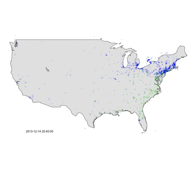
Figure 2: Animation of weather tweets on the afternoon of 13 December 2013. Green = rain, Blue = snow.
Earlier last week, we used the same language analysis techniques to track the system as it moved across the midwest. Figure 3 shows a snapshot of National Weather Service radar from the afternoon of 13 December 2013. The red arrows indicate the direction of the leading edge of the system, which at this point was dumping mostly snow.
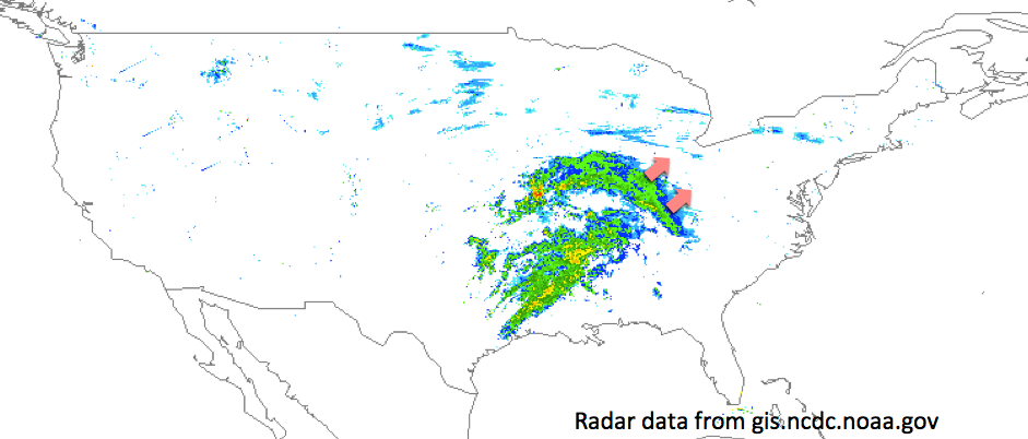
Figure 3: National Weather Service radar from the afternoon of 13 December 2013.
Figure 4 below shows an animation of our Twitter analysis on this same afternoon. You can clearly see a volume of tweets discussing snow migrating in a northeasterly direction along with the advancing weather front. Further south, ‘green’ tweets can be seen discussing the heavy rains falling in the area.

Figure 4: Animation of weather tweets on the afternoon of 13 December 2013. Green = rain, Blue = snow.
We’ll admit it, it’s fun to play around with data like this. It’s of course not lost on us that weather radar is probably a far more accurate means of monitoring precipitation. However, analytics research like this is very valuable in further honing the skills of our data scientists for studying complex operational issues. For example, instead of weather conditions the analysis might be scanning incoming IT incident tickets to identify common themes and root causes. In respect of client confidentiality we usually can’t discuss such projects in great detail on this site, but we’ll continue to share interesting analytics snapshots from publicly available datasets.