Coffee Break Insights: A Closer Look at #WhosGonnaWin

5 min read
This weekend sees Super Bowl XLVIII come to New York (yes, we’re well aware that the stadium is technically in New Jersey). Earlier this week one of our data scientists noticed the Empire State Building lights putting on quite a show. A quick search revealed that the iconic building’s lights are being used as a giant ‘sentiment meter’ to show the results of a Twitter war between Broncos and Seahawks fans. Fans were instructed to tweet responses including the hashtag #WhosGonnaWin to a series of questions about the upcoming game, with results announced on Verizon’s website.
We’ve posted previously on how our data scientists often tinker with Twitter data as a testing ground for natural language code. Most of these tweets come from Twitter’s Streaming API and we just happened to be collecting tweets about the Super Bowl over the same time period. The results posted on Verizon’s website were vague and lacked details on the precise logic used to determine the winners. The site says:
Verizon is monitoring all Super Bowl tweets and counts those conversations that use key words relevant to the #WhosGonnaWin daily question. Verizon then evaluates how many tweets are positive for each team. The percentages that you see on the graph demonstrate the overall measure of positive fan sentiment for each team.
Subsequent results were simply posted as single number scores with little explanation or elaboration on the underlying data (e.g., “Seahawks Win 50.39% to 49.61%”). Given that we had some of the data on hand, we couldn’t resist taking a closer look.
First we wanted to see who was participating in the Twitter war. We were able to find 414k tweets in our database with the hashtag #whosgonnawin captured between Jan 27th – February 2nd. In our experience only roughly 10% of tweets are tagged with GPS details, although with this particular dataset the number was closer to 1.5%. While that’s a tiny proportion of the overall volume, it’s still worth taking a look to see where this data is coming from. We started by looking at geo-tweets where the subject of the tweet is only about the Broncos.

Figure 1: Geographic plot of #WhosGonnaWin tweets mentioning the Broncos.
Not surprisingly we see a large concentration of tweets around the Denver area. We also notice a few localized spikes scatter at some less expected places, including an area north of Toronto. Closer inspection reveals that these anomalies are being caused by single users posting many times from the same location. To prevent any one user from getting too much attention, we limited each user to one geographic tweet during the timeframe of our analysis. After applying this filter, these odd geographic spikes disappear:
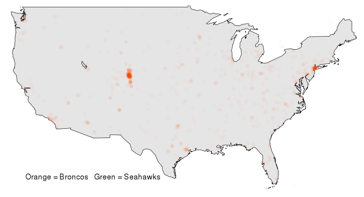
Figure 2: Geographic plot of Broncos #WhosGonnaWin tweets, but allowing only one geo-tweet per user.
After applying the same analysis to Seahawks tweets, we start to see the clear volumes for each team coming out of the Seattle and Denver metro regions:
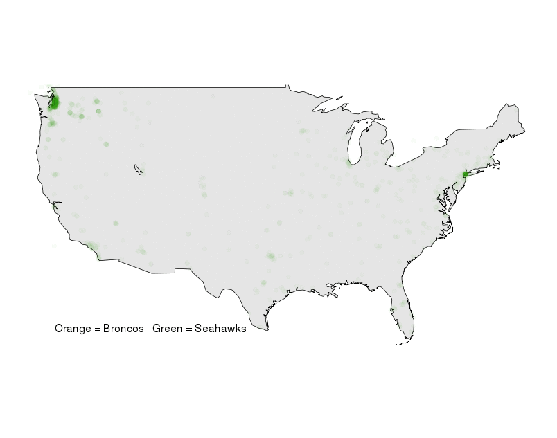
Figure 3: Geographic plot of Broncos and Seahawks #WhosGonnaWin tweets.
There are a few regions like greater Los Angeles that seem to be split between Broncos and Seahawks tweets, although with much smaller volumes. However, New York City still remains as a bright beacon of data that’s clearly oscillating between Broncos and Seahawks traffic. Are New Yorker’s really into the Super Bowl or is this traffic just coming from Seahawks and Broncos fans that have flooded into the city for Super Bowl weekend? To explore that question we zoomed in on NYC to see exactly where all that traffic is coming from. The results were quite clear:

Figure 4: Geolocated #WhosGonnaWin tweets coming from New York City.
The data clearly shows a strong concentration of tweets coming from Midtown Manhattan and specifically an area between roughly 30th and 50th streets west of Park Avenue. This is precisely along the stretch of Broadway that has been designated as “Super Bowl Boulevard” in the days leading up to the big game. This portion of NYC is also a giant tourist trap. While NYC as a whole didn’t seem to be getting into the #WhosGonnaWin battle, the tourists and football fans flooding Time Square seemed to enjoy it.
Finally, a word about applying additional text analytics towards the data. The Verizon site makes vague mention to an algorithm that tests the occurrence of “positive mentions” for each team. We looked at identifying tweets where only one team was the subject of the comment and then also combined this with our own internal ‘sentiment’ algorithm. However, with just a quick first pass we ran into some challenges with the analysis.
One such challenge was the not insignificant number of tweets containing variations on popular 4-letter words. Most of our text analytics at CKM is performed on internal company data, where the use of a 4-letter word would generally be a bad thing indicating extreme frustration or anger from an employee or customer. However, in the Twitter battle we observe that these words can be used to express both joy and anger.
Who’s going to win the Super Bowl? “The F***ing Broncos! (angry)” or “The F***ing Broncos! (excited)”. Both responses are exactly the same text, but without checking the broader context of the user’s comments and the intended mood of the post it’s hard to tell from 3 words alone if they’re happy or mad that they think the Broncos might win the Super Bowl. Since our text analytics algorithms weren’t appropriately trained to handle such nuances in this situation, we didn’t dive too deep into the ‘sentiment’ analysis (it is the weekend after all, and it’s time to watch some football). However, just for fun here’s a sample tweet that was amongst the ‘happiest’ sentences our algorithm picked from the dataset:
We won! The #empirestatebuilding goes #Seahawks Blue & Green for good! Now onto winning the SUPER BOWL! #WhosGonnaWin pic.twitter.com/ijHkDf3jr7
— Christa Wight Gerard (@cwightg) February 1, 2014
If we look purely at volumes of #WhosGonnaWin tweets talking specifically about either the Broncos or the Seahawks we see that the Seahawks seem to have a fairly consistent and solid lead over the Broncos.
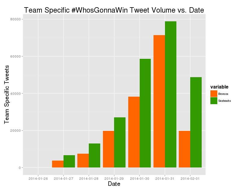
Figure 5: Volume of #WhosGonnaWin tweets specifically talking about either the Broncos or the Seahawks.
The official results shows the Seahawks winning each day except 1 and usually by a much smaller margin. Without knowing the precise algorithm for determining the ‘official’ winner it’s hard for us to replicate the original analysis, but the simple metric above seems to directionally agree that the Seahawks won this past week’s Twitter war. Will that translate into a win at MetLife Stadium? The game is about to start, so time to close the laptop and break out the snacks!
Update: Well… it looks like the Seahawks dominated the Broncos.
Notes on the Data and Analysis
This analysis relied on data from the Twitter streaming API. While the API is usually quite stable, it certainly doesn’t come with a guarantee to stream every tweet on the topics being monitored. Also, the geographic analysis was only conducted on tweets that contained latitude and longitude data encoded with the tweet. Such data is only a small fraction of the overall tweet volume and may not be representative of the true geographic distribution of this data; however, we have no particular reason to believe that it would not be broadly representative. Finally, we don’t know the precise algorithm used to capture and test tweets during the official #WhosGonnaWin contest and thus can’t speak to how our results compare or apply to the ‘official’ results. However, we would love for Verizon to post more technical details behind exactly what they did.
About Coffee Break Insights
Coffee break insights are short and simple samples of digital analytics using publicly available data sources. The name comes from the fact that many of these charts and graphs are the result of informal “I wonder what…” conversations that occur around the CKM Advisors coffee bar. While the topics are often wholly unrelated to our consulting work, such simple results highlight the power of leveraging digital data for studying activities within complex organizations.