Misleading Metrics and COVID-19 Data
(A follow-up to “Data Isn’t Just Data”)

6 min read
tl;dr: You can’t just crunch numbers and publish results. You have to understand where the data comes from and what it really means or your “results” might just be missed quirks in the raw data. There are some clear examples of that going on with COVID-19 analytics.
Last year we published an article “Data Isn’t Just Data” which focused on the broadly observed issue that analytics results are often published without considering where the source data comes from and what that data truly means.
Just crunching numbers without understanding or thinking about how the underlying data came into being can lead to analytics findings that are nothing more than preordained mathematical quirks baked-into the underlying numbers. Decisions or communications taken against these apparent results can be very dangerous, as the result itself is not real, even if the mathematical calculations in the analytics are technically correct.
The present COVID-19 crisis has upended all our lives and disrupted the global economy. Everyone is hungry for data, and media and public officials are eager to report, but the sheer scale and broadly fragmented infrastructure for testing and reporting creates many challenges on securing high quality consistent data across broad regions of the United States and the world. Most of this data centers around the number of COVID-19 cases, testing for the virus and deaths attributed to the virus.
Given the messiness and inconsistencies across datasets, understanding what the data actually says (or doesn’t say) is critical when conducting analysis and reporting findings to others.
“Data Isn’t Just Data” discussed how all data is simply the output of some instrument taking a measurement. To understand the data, one must understand how it is truly generated and what it really means or doesn’t mean. A thermometer doesn’t really measure temperature, it measures some property that is influenced by temperature such as the expansion of mercury in a tube or electrical resistance of a thermistor.
In the present context, “total COVID-19 cases,” as frequently reported, is usually just the number of positive test results. The instrument here is the PCR test for the virus; yet with testing still limited, few experts believe that the number of total tests is an accurate count of the true number of cases.
Anyone conducting analysis and reporting on data has an inherent responsibility to understand where the data comes from, understand how it’s generated and incorporate that into any results that are presented.
Across both official and unofficial channels these data points are being used to conduct various secondary and tertiary analytics, which carry with them all the flaws and uncertainties of the underlying raw data. There’s a strong need and potential to glean insights from less-than-perfect data, but doing so without full transparency around potential issues with such results is dangerous. In a desire to give soundbites or headline summaries misleading findings can work their way into the daily conversation. Let’s take a closer look at one such example.
A “Data Isn’t Just Data” Example
A very popular and broadly cited dashboard on the New York Times website displays various analytics and statistics on COVID-19 data across the United States.
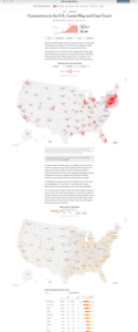
Among the findings reported is the “Case Growth Rate” by state, with an ability to compare the relative case growth rates across different states. The data for New York shows that since around the 25th of March the case growth rate for COVID-19 cases in the state has sharply and steadily declined. This finding is presented without qualification or further explanation.
To calculate a rate we need to know two things:
1. The thing we are measuring the rate of, and
2. The total population we are measuring against
In the cases of this analysis, the Times reports that “Growth rate shows how frequently the number of cases has doubled over the previous seven days” thus the dashboard is measuring how fast the number of cases is growing against itself, not the per-capita rate across the population.
This choice of growth logic is intriguing because if our measurement of X is inaccurate then the growth of X against itself will be even further from reality, as both the daily value of X and the total cumulative value of X are wrong. Any errors would only further compound over time.
On the surface it would appear that the results are showing a sharp decrease in the growth of cases in New York from late March. However, upon closer inspection of the underlying data it appears that this ‘finding’ is simply a mathematical proxy for the fact that testing in New York quickly hit a plateau with demand far exceeding capacity at that same time–a key element of the data missing from the interactive dashboard. The raw data offers little empirical evidence that the growth of cases was in fact slowing in March, and, given the quick limit hit on max-testing, likely demonstrates that the exact opposite was true.
Let’s look behind the numbers:
1. New York ramped up its testing efforts in mid-March to 20k-25k tests per day. However, while the amount of testing ramped up very quickly, it also quickly hit a plateau.
2. As testing expanded so did the number of reported positive cases. “The more you test the more cases you find” was a common phrase of the day. However, as the testing hit peak capacity, the number of positive cases reported each day also hit a plateau, by the same logic. A simple corollary to the initial statement is “The more we fall behind in testing, the more actual positives we don’t record.”
3. The total number of positive cases quickly accelerated as more testing was rolled out. However, once the testing capacity was reached and the rate of reported new cases was limited by that capacity, the growth of new cases follows a near linear line. There is no disagreement amongst experts that the true number of positive cases is much higher (10x has not been called unreasonable) thus the only real question about the positive case numbers is by how much this number is undercounting.
4. Once the reported case growth falls into a linear growth trend, limited by the plateaued testing capacity, the ‘rate of growth’ for the new positives follows a gradual linear decline. This is a simple preordained mathematical certainty—adding a similar amount each day to a growing denominator results in a decreased rate of growth.
5. Several high-profile media outlets such as the New York Times report this ‘rate of growth’ statistic and show that from late March the growth rate for the number of cases takes a sharp and steady decline. However, from the underlying data it appears that this statistic is heavily influenced by, if not the primary result of, limited testing and not an actual decline in case growth.
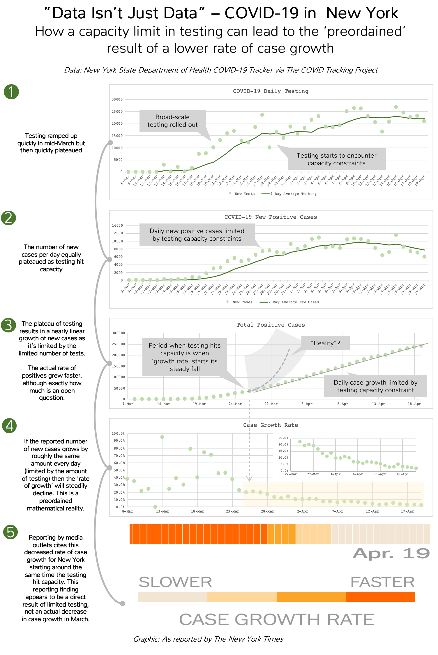
To be fair to the New York Times, they have reported elsewhere on the issues that differing tests rates can cause when attempting to calculate rates. For example, reporters cite how more testing generally results in a lower “death rate” as the denominator in that calculation becomes much larger. That more nuanced explanation doesn’t easily fit into a fancy infographic, but probably better to leave out these extra secondary and tertiary metrics if the full story of what it really says doesn’t fit on the page.
Another Example
One simple example demonstrating this point is New York City’s recent report that 4,400 of the 13,000 (34%) individuals reported as having died from COVID-19 were never tested and never appeared in the reported positive case numbers. If the true fatality rate of COVID-19 is 1% (some data suggests it could actually be much lower), just those 4,400 untested fatalities alone would translate into 440,000 uncounted positive cases. That’s over 3x the current number of officially reported positive test results, just from back-calculating from the untested COVID-19 deaths. Clearly any attempt to calculate positive case growth rate or fatality rate from the testing numbers alone would be a dangerous and misleading analytical endeavor. Presenting such results without clearly calling out the issues at hand breaks basic transparency practices in data science and should be avoided.
There are many other high profile examples across the COVID-19 sphere of missing the crux of the “Data Isn’t Just Data” philosophy, but you get the idea.
What are we to do?
Transparent Analytics
Anyone conducting analysis and reporting on data has an inherent responsibility to understand where the data comes from, understand how it’s generated, and incorporate that into any results that are presented. Yes, that’s hard. Yes, that takes more than one sentence to report; but either tell a complete and accurate data story or don’t tell the story at all.
Keep it Simple
If the data is messy, keep the analysis simple. Any secondary or tertiary derivations of messy raw data will only transfer, and likely amplify, flaws in the underlying data. Examples of that are clearly observed above with two different attempts to calculate ‘rates’ from problematic underlying data. A simple message that’s transparent is a far better analytics outcome than a fancy one full of holes and misleading findings.
Sense Check the Messaging
Any analytics should always be able to pass a basic smell test. If something smells off there’s a very good chance there’s either something wrong with the underlying data, the analysis, or the understanding of how the data came into being in the first place. Using the above as examples, it doesn’t make sense that the “fatality rate” of COVID-19 would steadily increase linearly by 500% over a few weeks. It also doesn’t make sense that the “growth rate” of positive cases is sharply declining when leaders across the country are screaming that a many-fold increase in testing is required. Both such smell tests are big red flags that the analysis and underlying data are likely grossly under-reporting the true number of COVID-19 cases.
Remember that data isn’t just data… it comes from somewhere and how it’s collected and what it really means matters a lot when trying to crunch numbers. Keep that in mind and you’ll avoid a lot of analytics pitfalls. Stay safe out there. Support our front-line responders and healthcare professionals. And remember “Data Isn’t Just Data”: you need to understand how it came into being and what it’s really saying.
For an example of CKM Analytix’s pro bono advanced analytics efforts to aid healthcare workers through the present situation check out this article.
Maanit Mehra is a Principal Data Scientist at CKM Analytix
Nicholas Hartman is the Chief Innovation Officer at CKM Analytix