Same Data, Different Story: Lessons in Storytelling from Covid-19 Reporting

4 min read
In a previous article, ‘Misleading Metrics and COVID-19 Data’ we considered the problem of crunching numbers and reporting results without fully understanding the underlying data or its quirks. In the context of the current COVID-19 crisis, this has been particularly evident, and the article discussed examples of decisions being made based on sound calculations from uncertain or even misleading data points.
In particular, it discussed the problematic ‘Case Growth Rate’ metric that was being reported by the New York Times website. A key element unaccounted for in the reported growth rate was the fact that testing in New York had reached a plateau with demand far exceeding capacity – although the math was not wrong, it definitely was not showing the right picture. And reporting the growth rate made it hard to intuitively understand. Interestingly, taking into account feedback from its readers, the dashboard has since been changed. It now shows per capita cases to ‘better reveal current hotspots.’
As leaders choose to focus on metrics that better suit their political messages, we have identified other ways that reporting the status of COVID cases is misleading. The choice of focusing on the Deaths, Deaths per capita, Rate of Testing or Total Number of Cases varies depending on political affiliations.
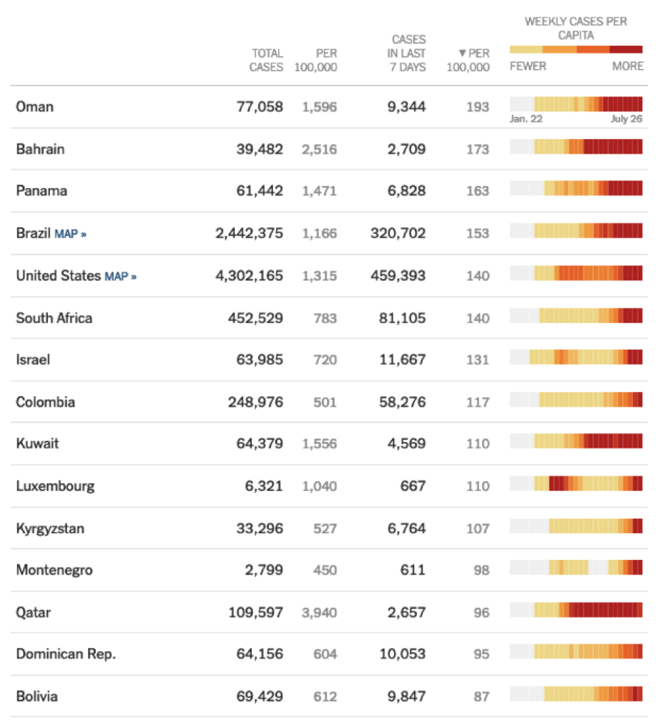
The World Health Organization (WHO) reports positive cases and deaths, cumulative and per capita here.
A Stat for Every Story
In the above example, it’s clear which metric you would use to portray your country’s response to the COVID crisis in the best light, and which metric you would downplay as not being relevant or nuanced enough. The choice is not analytical, it is political.
The image of the US as being the country worst hit by COVID-19 is not a very convenient picture for the US federal administration as it leads up to an election period but is convenient to potential adversaries. So, choosing to use a more flattering metric – and downplaying others – is an easy way to share a more positive message at the federal level. Similarly, although the UK is one of the worst-hit regions in the world, the government and officials can point to the highest rates of testing (per million) in the world.
It is important to remember that metrics are systemic aggregations of numbers that should help us in shedding light on a situation and understanding it better. If at any point you are unclear as to why a certain metric is being used, you should think carefully about whether it’s the numbers that are being manipulated or the audience.
Gaining Your Audience’s Trust
Of course, there are mental constructs where focusing on different metrics to show the different sides of a story is useful and encouraged (Hegels’ dialectic). It will help you to think in different ways, understand different angles, expose assumptions and lead to creative solutions.
It is also important to remember the real experiences of your audience and, consequently, what it expects to hear. If someone’s intuition of a situation (inductive or deductive) is very different to what you are presenting, then your interpretation is less trusted. If an individual sees the number of cases of COVID rising in his/her close-by community, but he/she is being told by a leader that the situation is under control, he/she will need to hear unambiguous facts or rock-solid reasoning. Choosing to portray only an arbitrary metric as the best (and only valid) one, when he/she knows that others exist, will make the reader disengage from the story completely. There must be a path between a (perceived) reality and the conclusions that are different.
The same goes when dealing with a client. If a client has a solid understanding of how his/her team works and where the pressure points are and if, as data scientists, you go in and only talk about unfamiliar metrics to tell your side of the story, you will not gain the trust of the client. Be aware and confident in discussing the different sides of the story, even when there is a specific one you want to focus on.
The Era of Misinformation
In the era of lightning-fast information transfer, it is very easy to knowingly or otherwise spread misinformation. Or falsely conflate correlation for causation. Consider for example the two maps below.
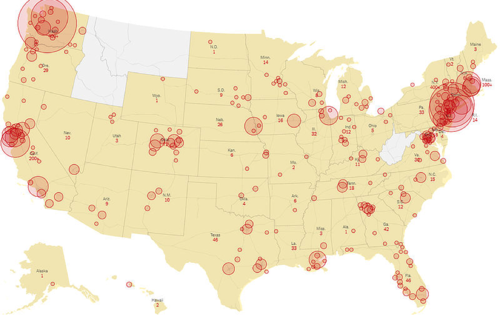
Figure 2: Coronavirus Map of the US. Source: Modern Survival Blog

Figure 3: 5G Network Coverage (USA)
If you were a Covid skeptic of any type, you could push the narrative that 5G networks cause Covid-19. Minus further context, you could frame an entire story based on this blatant falsehood. You can watch comedian John Oliver trash this conspiracy theory (and other Covid Conspiracies) here.
The point is that as both an audience and a presenter of data and facts, it is easy to fall prey to the trap of spurious correlations. Remembering that Correlation is Not the same as Causation greatly helps.

Figure 4: XKCD Comics
At the end of the previous article, we urged that as a final step, you should always be sense checking your message. If something smells off, it is probably off. Make sure you understand where the data is coming from and any assumptions that have gone into its collection and processing.
But there are questions you should ask, both as someone being presented with an analysis and as the person reporting an analysis. What are the motives behind the metrics? Are they being used solely because they strongly support the argument being made? Is there a gap in the story, are some more obvious metrics missing? And does the argument still hold when these are brought up for discussion?
As a data scientist, it is easy to get fixated on a specific view that you find particularly interesting and present it as the most important perspective to your client. But if it’s not intuitive, or familiar to your client, the message will be met with resistance. Worse, your client may suspect that you are only sharing one side of the story and that you are biased like a politician would be.
Let’s learn from this and remain conscious of how we frame our stories, not just cherry-picking the metrics that best match our agenda of the day. Framing the story as glass half-full or glass half-empty is a decision you make based on the circumstances, but never misrepresent or ignore the other 50%.